Today, I want to share one of my favorite paintings by one of my favorite artists!
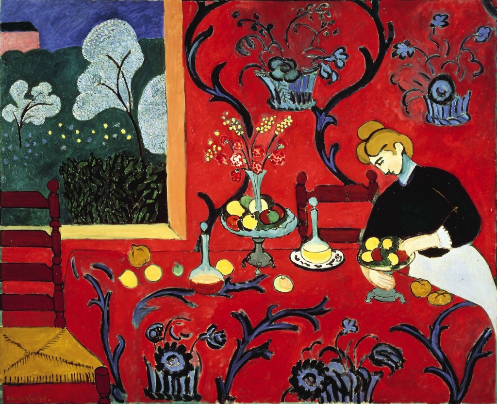
Henri Matisse (1869 – 1954), the French Expressionist painter, favored bold palettes and cheerful scenes. He painted “The Dessert: Harmony in Red” in 1908.
Often the use of red in painting is designed to give the viewer a feeling of horror, seediness, or a sinister feeling, particularly when it’s the predominant color. Matisse uses red quite a bit in his art, but there’s no negative feeling here. Instead, it’s a cheerful, bright scene and rather than upset the viewer or make him anxious, the red simply serves to lock in the viewer’s attention.

I just LOVE a good, French impressionist piece of art. This is very early “Matisse” indeed and very joyful I agree. I’m sure an art major could chime in here, but what I see is that the table becomes a tree of life like the trees outside.
LikeLiked by 1 person
Me too! As many times as I’ve looked at the painting, I never really gave a good look to the trees. It’s funny what catches your eye. I always look at the lemons.
LikeLiked by 1 person
Reblogged this on sketchuniverse and commented:
🔴🟥❤️ SO TRUE, BEAUTIES. WE ALSO CAN ENJOY THE CALM OF HOME. THIS BLOGGER DEPICTED IT, AS A “CHEERFUL, BRIGHT SCENE”.
LikeLiked by 1 person